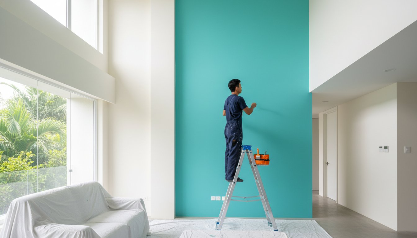
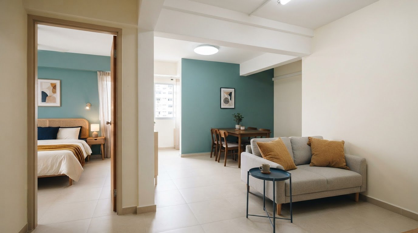
A home can feel connected without every room wearing the same colour. Creating a cohesive color palette for your home means choosing about 3 to 5 hues, then repeating them with intention. A base shade can cover 60% to 70% of the interior paint, while accents add contrast and personality.
It’s easy to see why choosing colours can feel daunting: a shade that looks calm in one room may seem too strong in another, especially as natural light changes. The goal isn’t to make every space identical, but to help the rooms feel like they belong together. In this guide, you’ll learn how to choose a shared palette, balance dominant and accent colours, and use colour thoughtfully in small spaces. We’ll also look at practical room-by-room choices, so you can create a home that feels harmonious while still letting each room express its own purpose and character.
Key Takeaways
- Choose a neutral foundation that works with your home’s furnishings and the way daylight shifts across each room.
- Use complementary colours with a clear visual hierarchy, so contrast adds energy without competing for attention.
- In compact rooms, try variations of one colour to create a more open, continuous feel.
- Carry consistent undertones, textures, or a shared design theme between rooms to make the home feel connected.
What does a cohesive colour palette mean?
A cohesive scheme makes rooms feel connected without making them identical. Start creating a cohesive color palette for your home with a neutral base, then repeat a few supporting hues through paint, furnishings, and details.
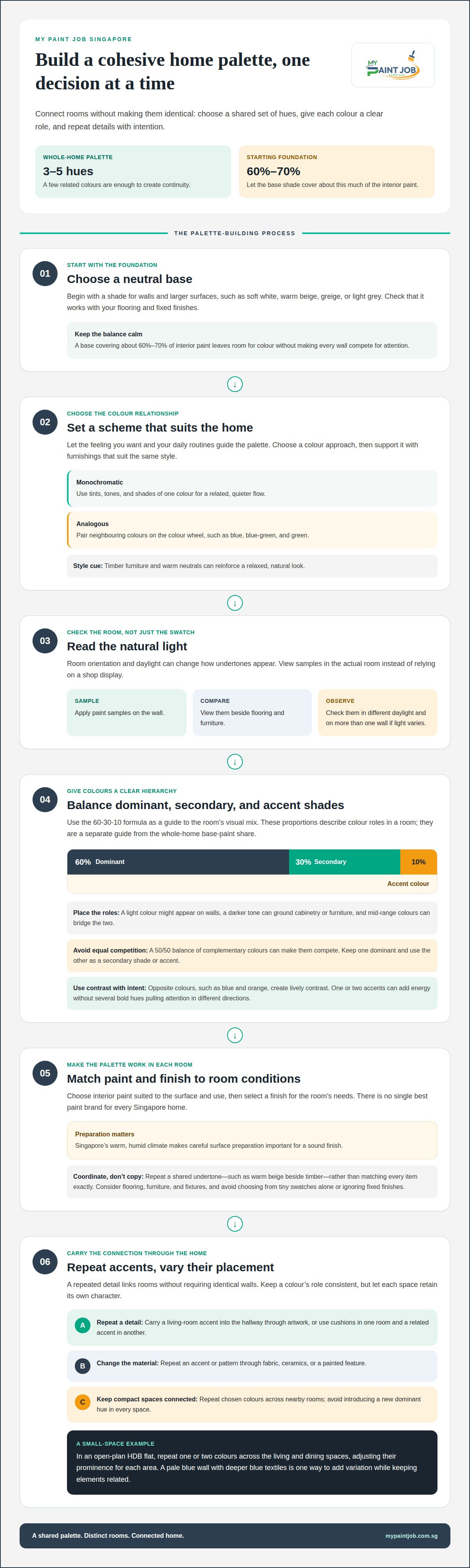
- Choose a neutral base. Select a shade such as soft white, warm beige, greige, or light grey for walls and larger surfaces. Aim for 3 to 5 hues across the home, with the base covering about 60% to 70% of interior paint. This leaves room for colour without making every wall compete for attention. Check that your chosen neutral suits your flooring and fixed finishes.
- Set a scheme that suits the home. Let your preferred feeling and daily routines guide the colours. A monochromatic scheme uses tints, tones, and shades of one colour; an analogous scheme pairs neighbours on the colour wheel, such as blue, blue-green, and green. Choose furniture that supports the same design style. For example, timber furniture and warm neutrals can reinforce a relaxed, natural look.
- Read the natural light before choosing paint. A room’s orientation and daylight affect how undertones appear, so view samples in the actual room rather than relying on a shop display. Test paint colours at home by applying samples on the wall and observing them beside flooring and furniture in different daylight. Compare the same shade on more than one wall if light varies across the room.
- Match finish and colour to the room’s conditions. There is no single best paint brand for every Singapore home; choose an interior paint suitable for the surface and use, then select a finish for the room’s needs. Singapore’s warm, humid climate makes careful surface preparation important for a sound finish. Avoid choosing colours from tiny swatches alone or ignoring fixed finishes. Coordinate walls with flooring, furniture, and fixtures by repeating a shared undertone, such as warm beige beside timber, rather than matching every item exactly.
Complementary colors and dominant versus accent colors
Build visual balance by giving each colour a clear role instead of letting every shade compete. These steps can help you choose accents that add contrast while keeping rooms connected.
-
Assign Dominant and Accent Colour Roles
Set a hierarchy using the 60-30-10 rule: dedicate 60% to a dominant colour, 30% to a secondary shade, and 10% to accents. Think beyond paint: the light role might appear on walls, while a darker tone grounds cabinetry or furniture. Mid-range colours can bridge those extremes. Check the overall visual weight in each room, and avoid splitting complementary colours evenly. A 50/50 balance can make the two shades compete.
-
Select Complementary Accent Colours
Choose accent colours opposite your dominant shade on the colour wheel for lively contrast. Blue and orange, for example, create a stronger visual difference than neighbouring blues. Keep one colour dominant and use the other as a secondary shade or accent. A home palette can include one or two accent colours, applied sparingly. Check that each selection supports the room’s intended feeling, and avoid several equally bold hues that pull attention in different directions.
-
Repeat Accent Colours Between Rooms
Carry an accent from one room into another through a considered detail, such as cushions in the living room and artwork in the hallway. Repetition creates a visual link without requiring identical walls. You can also repeat a pattern or accent colour in different materials, such as fabric, ceramics, or a painted feature. Keep the colour’s role consistent, and avoid clustering every accent in one room while leaving nearby spaces disconnected.
Before finalising wall colours, consider the condition of the surface beneath them. If damaged concrete is part of the project, spalling concrete repair addresses that surface issue as part of the preparation picture.
Applying color palettes in small spaces
For a whole-home palette, pair neutral walls with a few accent colours repeated in furnishings and details. In compact spaces, a restrained scheme and consistent colour roles help connect rooms without making them feel crowded.
-
Apply the 60-30-10 Colour Formula
Use the 60-30-10 formula as a starting point: let the dominant colour cover about 60% of the room, a secondary shade about 30%, and accents about 10%. In a small living room, this could mean a neutral wall colour, a coordinating tone on a rug or curtains, and a stronger hue in cushions. Treat the proportions as a guide for visual balance, not a demand to paint separate blocks of colour. Check how furnishings and other large elements affect the overall mix.
-
Keep the Palette Consistent
Repeat chosen colours across connected spaces so the eye can follow familiar details from one room to the next. For example, carry a living-room accent into a hallway through artwork, then use a related shade in a nearby dining area. The rooms can still have distinct identities: keep shared colours consistent while varying where they appear. Avoid introducing a new dominant hue in every space, which can make a compact home feel fragmented.
- Use a monochromatic palette when a small room needs a quieter visual flow. Choose different tints, tones, and shades of one colour, then layer them through paint, upholstery, and smaller pieces. A pale blue wall with deeper blue textiles, for example, creates variation while keeping the elements related. In an open-plan HDB flat, repeat one or two colours across the living and dining spaces, adjusting their prominence to suit each area. This approach links the spaces without requiring matching furniture or identical finishes.
Benefits of a cohesive home color palette
A connected palette does more than coordinate walls. In a Singapore home, it can guide choices across rooms, make transitions feel deliberate, and let personal details stand out.
- Create visual flow between rooms. Repeat a warm or cool undertone across the interior, even when individual rooms use different shades. For example, a warm neutral in the living room can relate to muted terracotta in the dining area through their shared warmth. This connection helps the eye move naturally between spaces instead of meeting a completely unrelated colour at each doorway.
- Make decorating choices easier. Use the palette as a filter when selecting accessories, artwork, or upholstery. If your scheme includes soft green and warm neutrals, a patterned cushion can bring both shades together. This makes new pieces easier to coordinate with existing furniture and reduces the chance of adding colours that compete with the room’s established character.
- Give each room its own character. Keep the underlying undertones consistent, then vary the colour emphasis by room. A bedroom might use quieter, softer shades, while a study introduces a deeper green through a desk chair or framed print. The repeated undertone links both spaces, while different applications reflect how each room is used.
- Let texture and finishes add depth. A cohesive palette doesn’t require every surface to be the same colour. Combine painted walls with timber, woven fabric, or patterned accessories to bring variation into the interior. For example, a neutral room can gain visual interest from a textured rug and darker wood pieces without introducing another dominant shade.
Before refreshing a room’s colour, address damaged concrete that could interrupt the finished look. Arrange spalling concrete repair as part of preparing the surface for a considered home refresh.
My Paint Job Singapore
My Paint Job Singapore can bring your chosen home palette to life with a carefully finished interior. If you’re ready to move from colour planning to painting, its HDB, condo, and landed painting services can help create a consistent scheme across rooms. The company also provides commercial painting services for commercial properties.
Surface preparation matters too. My Paint Job Singapore provides plastering services to help prepare walls for a smooth finish. Meticulous preparation and premium, eco-friendly paints support the painting work, with low-odour, zero-VOC paint options available. Share your preferred colours, the rooms you’re updating, and the overall feeling you want to create to help shape the project around your property and style.
Contact My Paint Job Singapore to discuss your painting project.
Bring Your Palette into the Home
Your colour plan can now move from inspiration to the walls and finishes you live with each day. Before starting, decide which rooms should feel connected and where you want a distinct shift in mood. That gives the painting work a clear direction and helps keep your choices intentional as the project takes shape. The value of creating a cohesive color palette for your home comes from making those choices work together, not from making every room identical.
My Paint Job Singapore provides painting services for HDB flats, condos, and landed homes. If you’re ready to put your palette into practice, share the rooms you want to refresh and the atmosphere you hope to create. Contact the team for a free, non-obligatory quote and a clear starting point for your interior project.
Contact My Paint Job Singapore to discuss your painting project. Take the next step with confidence and make your home feel more like yours.
Frequently Asked Questions
How do I choose a cohesive color palette for an entire home?
Start with finishes that are costly or difficult to change, such as flooring, kitchen cabinetry, and stone countertops. Identify their undertones, then choose paint and furnishing colours that sit comfortably beside them. For example, if your kitchen has cool grey stone, carry a related cool neutral into nearby rooms. A palette should suit both fixed finishes and the atmosphere you want each space to have.
What is the 60-30-10 rule for interior color palettes?
The 60-30-10 rule divides a room’s colour visually: about 60% dominant, 30% secondary, and 10% accent. For a study, the dominant colour might appear on walls, the secondary colour in a rug or curtains, and the accent in a lamp or artwork. Judge the balance across the whole room, including large furniture, rather than calculating exact painted surface area.
How do I use the color wheel to coordinate room colors?
Use the colour wheel to explore relationships before choosing paint. For a gentle transition, select neighbouring hues, such as yellow-green and green. For stronger contrast, choose colours opposite each other, such as purple and yellow, then let one take the lead. Check the colours alongside your fixed finishes and furnishings, since the wheel shows relationships but not how each shade will look in your specific room.
How do I transition colors between rooms in an open-plan home?
Keep the main wall colour continuous across connected areas, then distinguish each zone with furnishings, artwork, or a carefully placed accent. In an open-plan living and dining area, for instance, the dining chairs can introduce a deeper shade already present in nearby artwork. This creates distinction without an abrupt colour break. Consider sightlines from entrances and seating areas so transitions look intentional from different viewpoints.