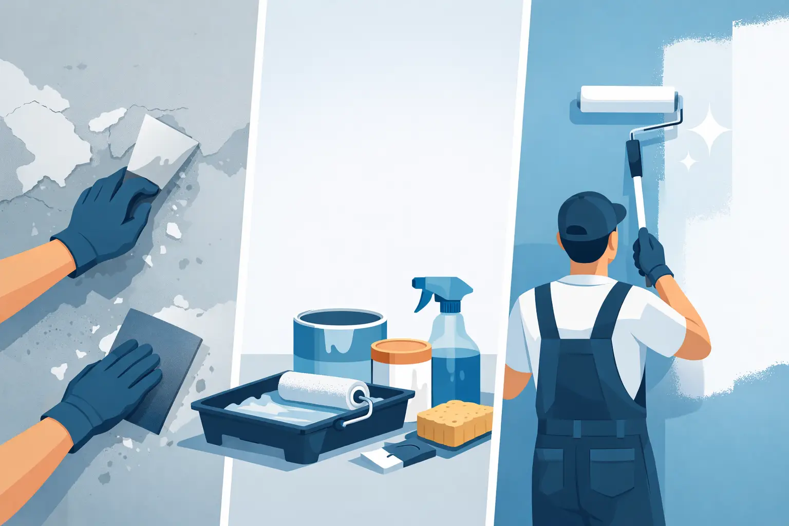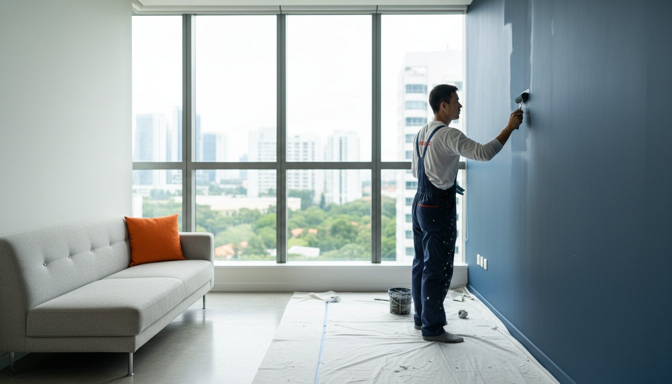
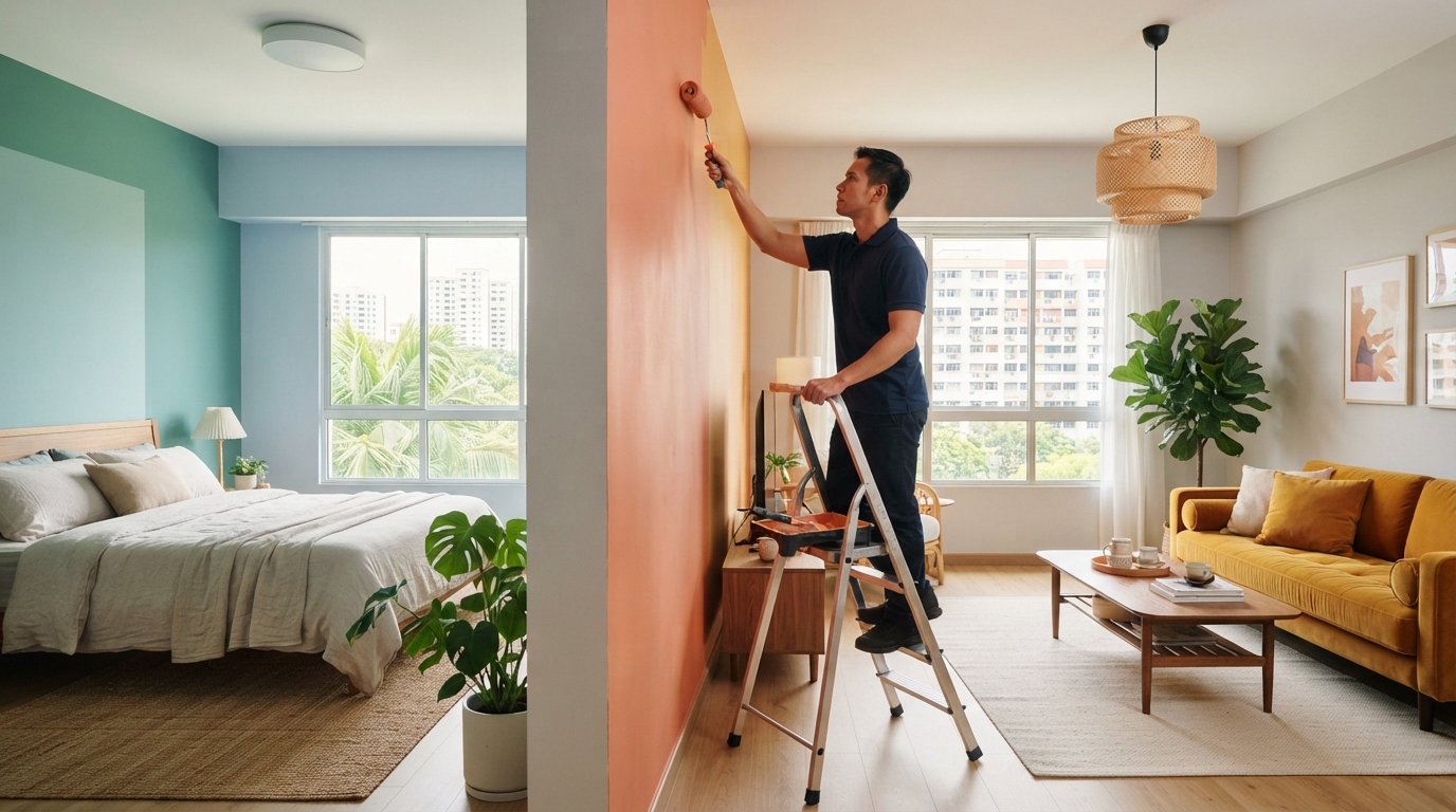
The same room can feel lively, restful or subdued depending on its paint color. Understanding how paint color affects your mood starts with this: warm shades such as red, orange and yellow tend to feel energising, while cool shades such as blue and green often feel calming. These are tendencies, not rules, and your own associations matter too.
It makes sense that colour changes how a space feels, but choosing a shade involves more than picking a favourite. The amount of colour, the room’s purpose, natural light and surrounding finishes all affect the result. Neutrals can feel balanced and welcoming, though too much white may seem stark.
This article explains how different colours may influence emotions and behaviour, where they can work well at home, and how neutrals, lighting and room size affect the atmosphere. You’ll have a clearer way to choose colours that suit the feeling you want, without treating colour psychology as a one-size-fits-all formula.
Key Takeaways
- Use your own memories and cultural associations as a guide, since the same shade can feel different to different people.
- Balance neutral walls with considered accents and furnishings to create warmth without making a room feel visually harsh.
- Match colour choices to how you use each space, from restful bedrooms to lively areas for gathering and conversation.
- Consider shade depth, lighting and room size together, as each can change how a colour feels and how spacious the interior appears.
What Is Color Psychology?
Color psychology explores how colour associations may shape feelings and perception. Lighting and room size also affect how paint looks: incandescent light can make pale shades appear brown or orange, while dark shades may look deeper.
Personal and Situational Color Responses
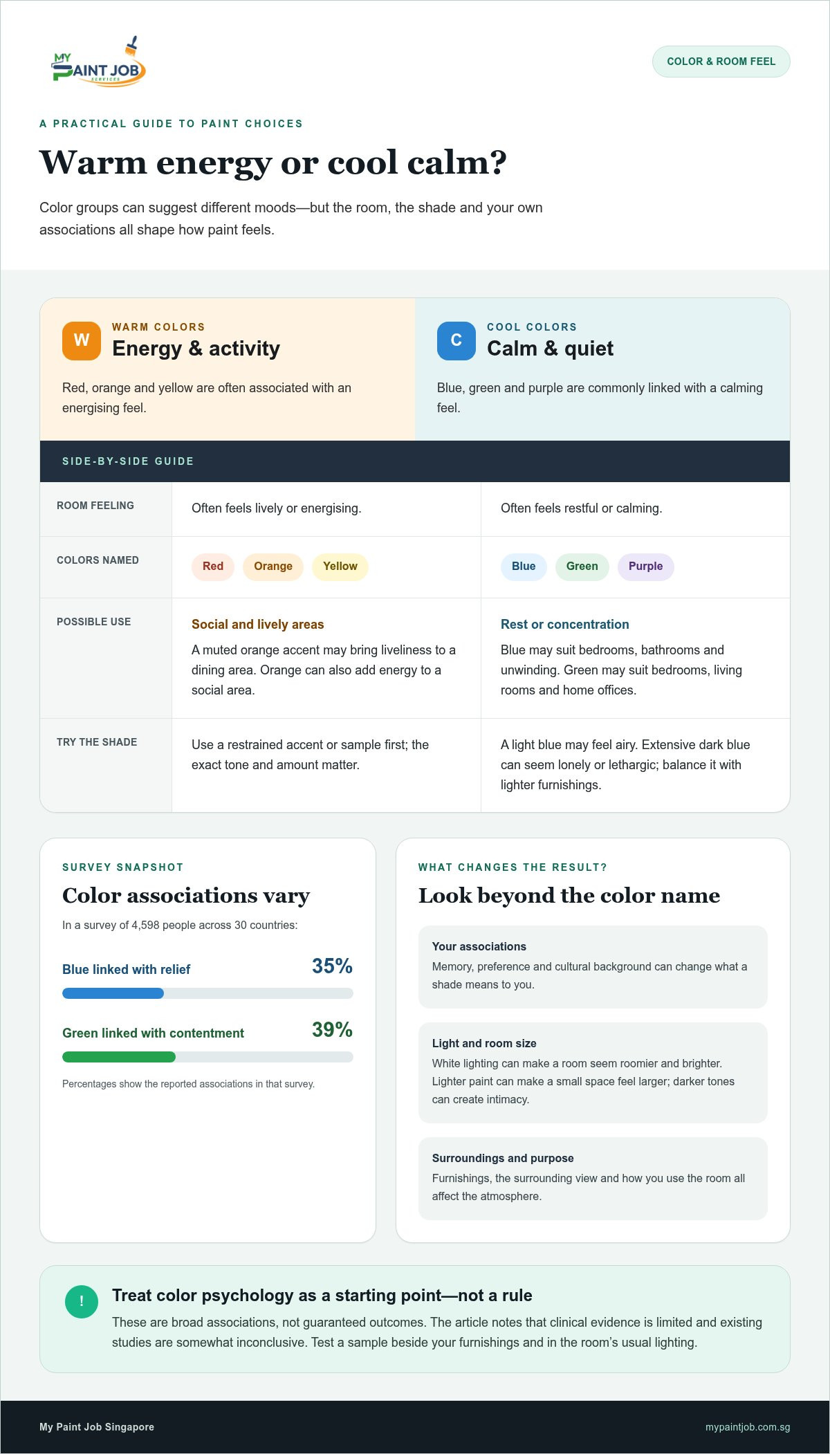
Personal and situational responses are meanings attached to colour through memory, preference, and setting. They matter because blue may feel restful in a bedroom but cold beside a shaded kitchen window. In a survey of 4,598 people across 30 countries, 35% linked blue with relief and 39% linked green with contentment. Urban settings painted green were less positive and more arousing than natural settings. The surrounding view can influence how an interior colour feels.
Cultural Influences on Color
Culture shapes shared colour symbolism, which matters in homes with different backgrounds. White often suggests purity and cleanliness in Western cultures. In certain Eastern cultures, it is associated with mourning and funerals. Personal preference can outweigh a general convention: someone who sees purple as celebratory may respond differently from someone with another association. Consider who uses the room and what colours mean to them.
Warm and Cool Emotional Effects
Warm and cool are broad colour groups with commonly associated emotional responses. Red, orange and yellow often feel energising, while blue, green and purple often feel calming. Orange can bring energy to a social area, while soft greens may suit a quiet reading corner. Use these associations as a starting point for interior design, not as fixed outcomes. Colour psychology has limited clinical evidence, and existing studies are somewhat inconclusive.
Lighting and room size can change a shade’s appearance and a room’s atmosphere. White lighting can make an interior seem roomier, clearer and more luminous. Lighter paint can make a small space feel larger, while darker tones create intimacy. Try a colour as an accent before applying it across a whole room. Check how it looks beside the furnishings and under the room’s usual lighting.
Neutral colors and balanced interiors
Neutral shades give an interior a flexible visual foundation. Beige, grey and soft white can create balance, letting furniture, artwork and natural textures share attention without competing. In a living room, warm beige walls can soften the look of timber furniture, while soft white can keep the setting bright. The psychology of color also depends on how these shades work together, not just on the paint chosen.
Interior design uses contrast to give neutrals character. Pair warm walls with a cooler grey sofa, or add a muted yellow cushion against pale walls. A considered accent brings energy and focus, while repeating a small group of tones helps the room feel cohesive. Cool colors can temper a warm palette, and natural textures such as wood can make a restrained scheme feel more inviting.
Culture shapes how a neutral color is associated with a space. White can suggest purity and cleanliness in Western cultures, while in certain Eastern cultures it is associated with mourning and funerals. That difference matters when choosing a shared room’s palette. In a home with varied cultural backgrounds, combine white with familiar furnishings or warmer accents so the interior reflects the people who use it.
Color choices can also influence social interaction. A living room with warm neutrals and a yellow accent may feel more welcoming for conversation than one dominated by stark white. Too much white can feel sterile, harsh or lonely. Use a soft neutral as the main field, then introduce colour through cushions, rugs or wall art. These details can add energy without making the room feel visually crowded.
Room proportions affect the balance, too. Light shades and soft neutrals can make a compact space feel larger, while a darker feature wall creates intimacy. A bold accent can add personality without crowding a small room. Consider how the paint relates to furniture, lighting and the room’s purpose before settling on a whole-room scheme.
For a refreshed interior, explore professional painting services as part of your palette plans.
How Do Different Colors Affect Us?
Understanding how paint color affects your mood starts with matching a shade to the room’s purpose. Warm and cool colors offer useful starting points, but the exact tone and amount matter.
Suggested Effects of Warm and Cool Colors
Warm colors such as red, orange and yellow are often associated with energy and activity. Cool colors, including blue, green and purple, are commonly linked with calm. These associations can help guide a palette: a muted orange accent may bring liveliness to a dining area, while a softer blue may suit a space for unwinding. Choose the room’s function before choosing the shade.
Warm and Cool Undertones
Undertones are subtle warm or cool hues within a paint color, and they influence how it sits beside furnishings. A grey with a blue undertone can feel crisp beside pale finishes, while a beige undertone may harmonise with timber. To see how paint color affects your mood at home, test a sample on the intended wall. View it in daylight and under your usual evening lights before deciding.
Cool Colors and Calm
Cool colors can support a quieter atmosphere in spaces used for rest or concentration. Blue is suggested for bedrooms, bathrooms and areas intended for unwinding; green can suit bedrooms, living rooms and home offices. A light blue may feel airy, while extensive dark blue can seem lonely or lethargic. Balance a deeper shade with lighter furnishings so the room retains visual ease.
Colors for Focus and Creativity
Blue is linked with focus and productivity, making it a possible choice for a study nook or home office. Green is associated with creativity, while orange and yellow may encourage innovative thinking. For example, use a restrained green behind a desk or add yellow through a smaller painted accent. Knowing how paint color affects your mood can help you align the palette with the activity, rather than relying on color alone for productivity.
How colors may affect emotions and behaviour
Paint can shape how a room feels and how people use it, but colour associations aren’t fixed rules. A red dining area may feel lively and encourage conversation, while the same strong shade could feel too stimulating in a bedroom used for rest.
Red is associated with excitement and can stimulate conversation, so a small accent may add energy without dominating the room. In one study, students shown a red number before a test scored more than 20% lower than students shown green or black numbers. This finding concerns a specific test setting, not a guaranteed effect from red walls, but it shows why context matters.
Yellow is linked with happiness and positivity, and a soft shade can brighten a kitchen or breakfast nook. Bright yellow across a large area may feel overwhelming or anxiety-inducing, so a lighter or pastel version can offer a gentler impression. Orange can feel warm and inviting, making it a possible choice for a dining space or creative corner.
Green is associated with nature, balance and calm. Lighter greens may feel fresh, while deeper shades can seem grounding. Orange and yellow are also associated with innovative thinking, and green may suit a space for artistic work or brainstorming. Try these shades where the activity fits, rather than treating colour as a substitute for a practical layout.
Black can add definition as a limited accent, but using too much may create a gloomy or melancholic impression. Dark colours can make rooms feel cozier; lighter ones can make them seem more spacious. In Singapore homes, consider how daylight and evening lighting alter these effects, and choose a shade that feels comfortable during the room’s actual use.
Colour psychology has limited clinical evidence, and existing studies are somewhat inconclusive. Treat associations as design cues, then weigh your own feelings, the room’s purpose, and the amount of colour. For a carefully finished change of atmosphere, arrange a painting project suited to your interior.
My Paint Job Singapore: HDB painting services
My Paint Job Singapore helps turn your colour choices into a carefully finished interior through HDB painting services. Whether you’re refreshing an HDB flat, choosing a calming bedroom shade or adding a brighter accent to a living area, professional painting can bring the scheme together with careful surface preparation and finishing.
The team also handles condo, landed and commercial painting services, tailoring the work to different property types and spaces. Share the atmosphere you want, such as a restful room or a welcoming gathering area, and the selected palette can guide the painting plan. For walls that need attention before a new colour is applied, plastering services can prepare the surface.
Contact My Paint Job Singapore to discuss your painting project.
Make Your Next Colour Choice Feel Like Home
Let the room’s role guide your final decision. Think about how paint color affects your mood, then choose a palette that supports the way you want to live there. A home’s colours become part of everyday routines, from quiet mornings to evenings spent together, so choose a finish that feels considered rather than simply fashionable.
Once you’ve settled on a direction, the next step is bringing it to the walls with careful workmanship. My Paint Job Singapore offers HDB, condo and landed painting services for homeowners planning a refresh. A clear idea of the atmosphere you want can help shape the project, whether you’re updating one room or creating a more cohesive feel throughout your home.
Ready to move from colour ideas to a refreshed interior? Contact My Paint Job Singapore to discuss your painting project. Take the next step at your own pace and create a home that feels more like yours.
Frequently Asked Questions
What are the best colors for mental health?
There isn’t one paint color established as best for mental health. Choose shades that feel comfortable to you and suit the room’s everyday use. For example, a soft green may feel pleasant in a quiet reading corner, while a favourite warm neutral might make a shared room feel more welcoming. Paint can shape a room’s atmosphere, but it isn’t a mental health treatment.
Can Color Be Used as Therapy?
Color can be part of a calming environment, but paint color isn’t a proven stand-alone therapy. Evidence for color psychology is limited, and studies are somewhat inconclusive. Its effectiveness hasn’t been established as greater or lesser than mood-regulation practices such as meditation or journaling. For example, choosing a restful wall shade can support a relaxing routine, but it shouldn’t replace professional care when someone needs it.
What color means happy?
Yellow is commonly associated with happiness: in a survey of 4,598 people across 30 countries, 52% associated yellow with joy. Orange was linked to joy by 44% of respondents in that survey. These associations describe reported responses, not a universal meaning. If yellow feels too intense in a sunny room, a softer shade or a small accent can bring brightness without filling every wall.
What is the best color for bedrooms?
Blues, greens, soft purples and warm neutrals are suggested bedroom choices because they can support a restful atmosphere. Consider how the room looks at night as well as during daylight. For instance, a muted blue paired with warm-toned bedding may feel gentler than a highly saturated blue across every wall. Personal preference matters: choose a shade you enjoy seeing as you wind down.
How do different paint colors affect mood and emotions?
Color associations can influence a room’s perceived energy, but the effect depends on the shade and how much of it you see. In the same international survey, 68% associated red with love, while 50% linked pink with love. A vivid shade across a whole room may feel stronger than the same color on one wall. Compare samples beside your furnishings before deciding.
What does research say about color psychology and paint colors?
Research suggests color associations exist, but it doesn’t provide a reliable formula for choosing paint to produce a specific feeling. In one relaxation experiment, participants exposed to blue showed reduced stress, while a control group exposed to white also showed decreased stress. This illustrates why results need careful interpretation. Use research as context, then consider your own preferences, room use and lighting.