A fresh coat of paint can make a room feel larger, calmer, brighter, or more considered without changing a single piece of furniture. The most useful home wall colour trends are not about copying a shade from a showroom display. They are about choosing colors that work with your natural light, daily routines, existing finishes, and the atmosphere you want to come home to.
For homeowners, tenants, landlords, and property managers, the best trend is one that still looks polished after the excitement of a renovation has passed. That means balancing current color direction with practical details such as wall condition, room size, cleaning needs, and the quality of preparation beneath the paint.
Home Wall Colour Trends Are Moving Toward Comfort
The strong white-and-gray interiors of recent years are giving way to warmer, more livable neutrals. This does not mean every room needs to be beige. It means colors are carrying more warmth and depth, helping spaces feel less stark while remaining easy to furnish.
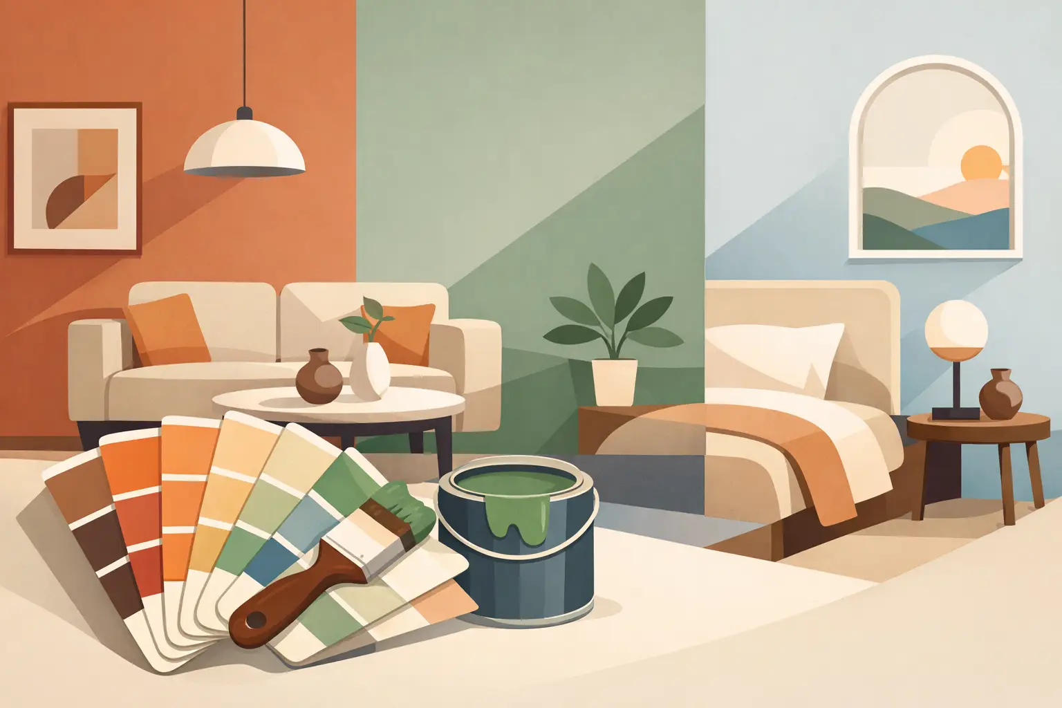
Soft mushroom, warm taupe, putty, sand, oatmeal, and pale greige are popular alternatives to cool gray. These shades work especially well in living rooms, hallways, and bedrooms because they make wood furniture, black fixtures, cream upholstery, and natural textures feel intentional rather than mismatched.
The trade-off is undertone. A beige with too much yellow can look dated under warm bulbs, while a gray-beige with too much violet may appear dull in a low-light room. Paint samples should be viewed on the actual wall at different times of day, not judged under store lighting alone. A professional color consultation can help identify whether a shade reads warm, cool, or neutral in your space.
Earthy Greens and Blues Bring Quiet Character
Muted greens remain a dependable choice for homeowners who want color without making the room feel busy. Sage, eucalyptus, olive-gray, and softened moss work well in bedrooms, studies, dining areas, and entryways. They feel grounded, pair naturally with timber and stone finishes, and are generally easier to live with than bright green tones.
Blue is also moving away from sharp, highly saturated shades. Dusty blue, blue-gray, muted teal, and deep mineral blue can create a calm backdrop for rest or focused work. In a home office, blue may give the room more structure. In a bedroom, a softened blue can feel restful without becoming cold.
Darker colors need thoughtful placement. A deep green or blue can look refined on a feature wall, built-in cabinetry, or a well-lit dining room. In a narrow corridor or a room with limited daylight, the same color can make the space feel enclosed. The answer is not always to avoid dark paint, but to use it where the room can support it and balance it with lighter ceilings, trim, flooring, or furnishings.
Soft, Sun-Washed Warm Colors Are Reappearing
Terracotta, clay, muted blush, dusty peach, and pale apricot are returning in more restrained versions. These tones bring warmth to homes with white tile, light wood, neutral sofas, or black metal accents. They are particularly effective in dining spaces, bedrooms, powder rooms, and creative corners where a little personality is welcome.
The modern approach is subtle. Rather than painting every wall in a strong orange-red, many homeowners choose a faded clay shade, a warm pink-beige, or a single accent area. These colors can make a room feel welcoming, but they must work with permanent elements such as flooring, countertops, doors, and window frames.
If you are preparing a rental unit or property for sale, use these warmer tones more carefully. A warm neutral is broadly appealing, while a statement terracotta may be better reserved for an owner-occupied space. The right choice depends on whether the goal is personal expression, quick tenant appeal, or a clean presentation for prospective buyers.
Color Drenching Creates a More Finished Look
One of the most noticeable home wall colour trends is color drenching: painting walls, trim, doors, and sometimes the ceiling in closely related tones. This treatment reduces visual breaks and can make a room feel more cohesive, particularly in compact spaces or rooms with architectural details worth highlighting.
A soft olive wall with slightly deeper olive trim, for example, can make a study feel tailored. A warm off-white applied across walls and trim can give a bedroom a calm, hotel-like finish. The effect depends on careful surface preparation and clean cutting-in around frames, switches, and ceilings. Uneven plaster, old paint ridges, cracks, or poorly repaired holes become more visible when one color wraps the entire room.
For many homes, a full color-drenched room is more commitment than necessary. A simpler option is to paint the walls and interior door in the same shade while keeping the ceiling and baseboards lighter. You still gain a coordinated look without making the room feel too dark or closed in.
Ceilings and Trim Are Part of the Color Plan
Ceilings are no longer automatically bright white. A ceiling painted in a pale version of the wall color can soften contrast and make a room feel more complete. This works well when the wall shade is light to medium in depth and the ceiling is in good condition.
In homes with lower ceilings, a crisp but not overly blue white can preserve a sense of height. In rooms with high ceilings or strong daylight, a gentle cream or very pale warm gray can make the space feel less echoing and more comfortable. The key is choosing a ceiling color that supports the wall color rather than competing with it.
Trim deserves the same attention. Bright white trim can look clean next to navy, green, and charcoal walls, but it may feel too sharp against warm beige or clay tones. A softer white, warm ivory, or matching wall color often produces a more refined result. Small decisions around doors, baseboards, and window frames are what separate a basic repaint from a carefully finished room.
Choose Trend Colors That Work for Real Life
Before settling on a color, consider how the room is used. A busy entryway, family room, or hallway benefits from a durable finish that is easy to wipe clean. A matte look can be elegant, but on high-contact walls it may show marks more readily than an appropriate washable paint finish. Bedrooms and formal spaces offer more freedom to prioritize a soft, low-sheen appearance.
Light also changes everything. North-facing rooms tend to receive cooler light and often benefit from warm neutrals or softened earth tones. Rooms with abundant afternoon sun can handle cooler colors, though very pale shades may appear almost white at the brightest part of the day. Test large sample areas beside flooring, curtains, and fixed furniture before approving the final palette.
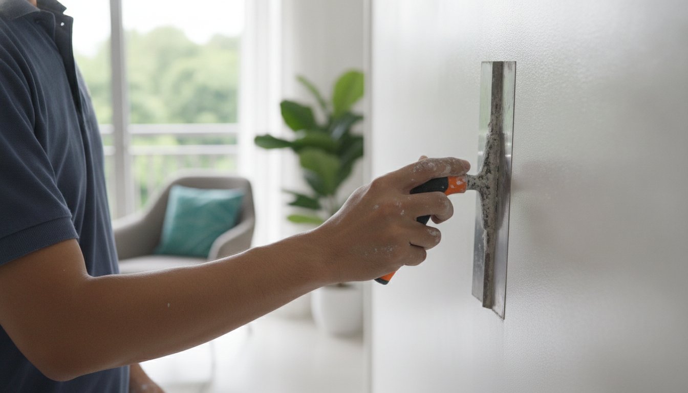
Wall condition matters just as much as color. Fresh paint cannot hide flaking surfaces, hairline cracks, water stains, uneven patching, or spalling concrete. Proper repairs, sanding, sealing, and primer selection create the smooth base needed for colors to look consistent and last well. Skipping preparation may save time at first, but it often leads to visible flaws and early touch-ups.
A Professional Finish Makes Trend Colors Last
Color selection is only one part of a successful painting project. Furniture protection, careful masking, surface repairs, quality paint, and thorough cleanup all affect the final result. This is especially valuable when repainting an occupied home, a rental property between tenants, or a business space that needs to remain presentable.
My Paint Job helps clients manage the process from color guidance through preparation, painting, and cleanup, with options suited to both residential and commercial spaces. Whether you prefer warm neutrals, a calming green bedroom, or a more dramatic color-drenched feature, skilled application ensures the shade looks as intended across every wall.
The right paint color should make your space easier to enjoy, not harder to maintain. Start with the mood you want, check how the shade behaves in your light, and give the preparation work the attention it deserves. A well-chosen color, applied with care, can make a familiar room feel genuinely new.