
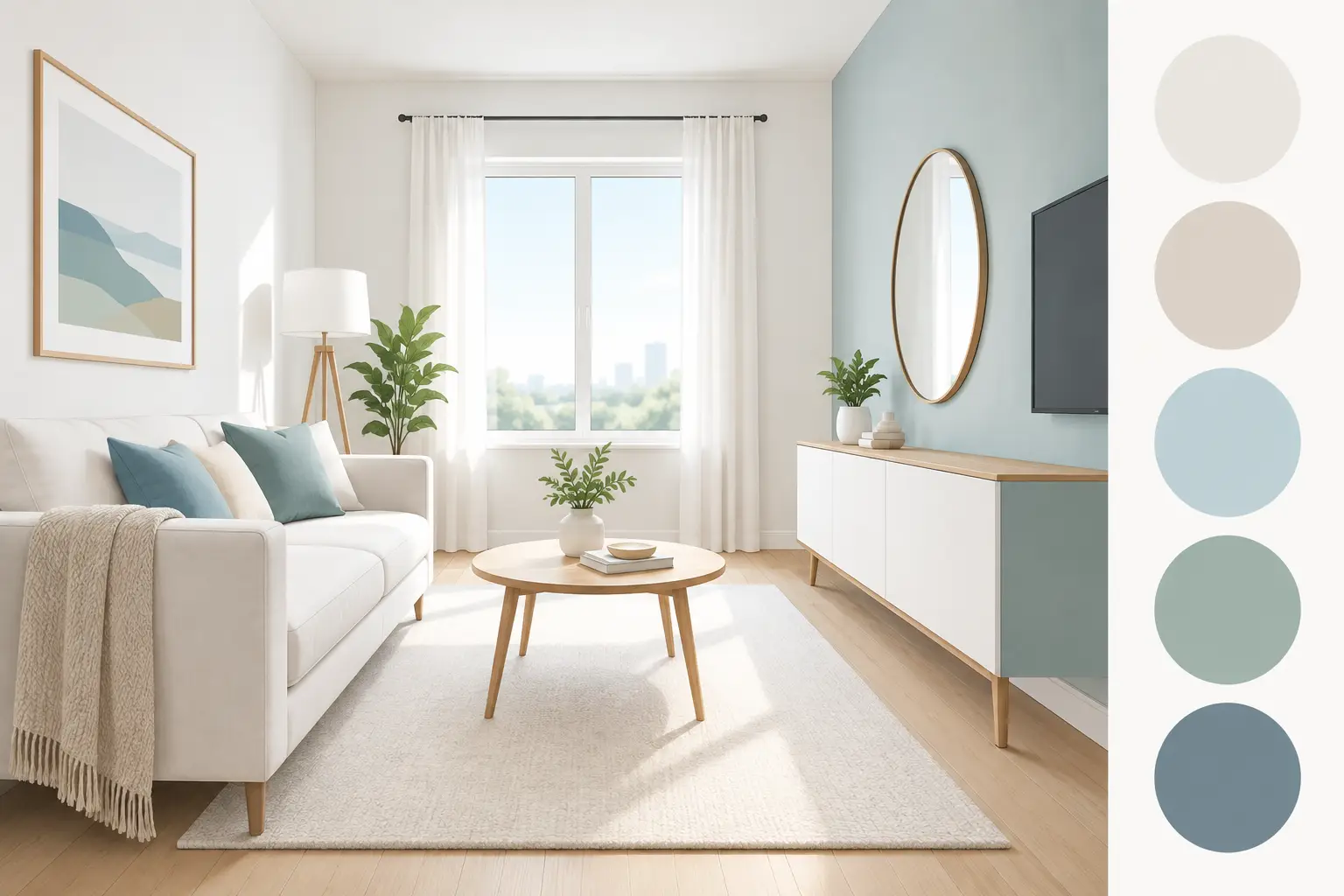
A small room can feel surprisingly generous when the walls, ceiling, trim, and light work together. The best colors for small rooms are not limited to plain white. The right choice depends on how much daylight the room receives, what the room is used for, and whether you want it to feel brighter, calmer, cozier, or more defined.
For a compact bedroom, HDB study, condo bathroom, or narrow office meeting room, paint is one of the most cost-effective ways to improve the sense of space. A professional color plan also prevents a common disappointment: choosing a color that looked airy on a small paint chip but feels cold, dull, or much darker once it covers four walls.
Why Color Changes the Way a Small Room Feels
Color does not physically enlarge a room, but it affects how clearly the eye reads its boundaries. Light-reflective shades can make walls appear to recede, creating a more open impression. Soft, low-contrast combinations keep the room from being visually broken into smaller sections. In contrast, strong changes between wall color, trim, and ceiling color can emphasize every edge and make a compact layout feel more enclosed.
That does not mean every small room must be pale. Darker colors can be an excellent choice when the goal is intimacy and character. A deep, consistent shade can blur the room’s corners, especially in a space used mainly at night, such as a bedroom, powder room, or media room. The key is choosing the effect deliberately rather than assuming light colors are always the only answer.
Best Colors for Small Rooms With Limited Natural Light
Rooms with small windows, shaded orientations, or neighboring buildings close by need careful attention to undertones. A white that appears crisp under showroom lighting may look gray or slightly green in a dim room. Instead, consider warm off-whites, light cream, gentle beige, or pale greige. These shades reflect available light while keeping the space welcoming rather than stark.
Soft warm white is often a dependable option for compact living areas and bedrooms. It works particularly well with wood furniture, warm lighting, and neutral flooring. Light greige offers more depth than white and can help hide everyday marks in hallways or busy family spaces. For homeowners who want a fresh look without a clinical finish, these shades strike a practical balance.
Pale blush, muted peach, and soft butter yellow can also bring warmth to a room with limited sunlight. They should be subtle rather than bright. Highly saturated yellow can feel intense on surrounding walls, while a muted version can give the room a gentle glow.
Avoid Cool White Without Testing It First
Cool whites and blue-based grays can look clean in a bright, modern space. In a dim small room, however, they may turn flat and chilly. Paint a test area on more than one wall and check it in the morning, afternoon, and evening. The color is only right if it still feels comfortable under the lighting you actually use.
Light Colors That Make Compact Spaces Feel Open
For most small rooms, soft neutral colors remain the safest route to an airy result. They are flexible enough to suit changing furniture, curtains, and décor, which matters for landlords, tenants, and homeowners planning future updates.
Consider these reliable directions:
- Warm white for a bright, clean foundation without harshness.
- Pale greige for a refined neutral that works across living rooms, bedrooms, and offices.
- Light mushroom or taupe for a warmer, more grounded feel.
- Misty blue-gray for a peaceful bedroom or bathroom with decent daylight.
- Muted sage for a calm, natural look that still feels light.
The strength of these colors is not simply that they are pale. Their softness keeps visual contrast low, allowing furnishings and architectural details to feel connected instead of crowded. In a small living room, for example, a light greige wall paired with similar-toned curtains can make the perimeter feel less interrupted.
Should You Paint a Small Room White?
White can work beautifully, but it is not a universal solution. Pure bright white reflects light well and creates a sharp, contemporary appearance, especially in rooms with ample daylight and clean-lined furnishings. It can also reveal scuffs, uneven plastering, and shadows more readily than a slightly warmer neutral.
For small rooms with textured walls, patch repairs, or older finishes, an off-white is usually more forgiving. It retains the brightening benefit while adding enough softness to make the finish feel polished. Good surface preparation matters here. Cracks, dents, peeling paint, and rough areas can stand out after a fresh coat, regardless of how well the color was chosen.
Painting the ceiling the same white or a closely related shade can also help. A sharp color break at the ceiling draws attention to the room’s height. A coordinated color transition lets the eye travel upward more smoothly.
When Dark Colors Work Better in Small Rooms
A compact space does not need to pretend it is larger if a dramatic, restful atmosphere better suits its purpose. Deep navy, charcoal, forest green, rich brown, and smoky plum can make a small room feel intentional and sophisticated. This approach works especially well in powder rooms, reading corners, studies, and bedrooms where comfort matters more than brightness.
The most successful dark rooms usually have a clear plan. Paint walls, trim, and sometimes the ceiling in the same or very similar shade. This reduces contrast, softens awkward corners, and creates a cocooning effect. Add layered lighting, including warm ceiling lights, table lamps, or wall fixtures, so the color looks rich rather than gloomy.
The trade-off is practical: darker paint may show dust, fingerprints, and roller marks more easily, particularly in high-touch areas. It also requires careful application and sufficient coats for an even finish. For a professional result, the wall surface must be properly repaired, primed where needed, and painted with the right tools and technique.
Choose the Right Undertone for Your Flooring and Furniture
A paint color can appear completely different beside gray tile, warm timber, beige vinyl flooring, or dark cabinetry. Before finalizing a color, look at the elements that will remain in the room. Flooring, built-in wardrobes, doors, countertops, and large sofas have more visual influence than small decorative pieces.
If your flooring has warm yellow, red, or brown notes, choose warm whites, beige, cream, or greige with a soft brown undertone. Pairing these floors with a stark blue-gray can make both the wall and floor look less appealing. If your home has cool gray tiles or black-and-white finishes, a balanced neutral, soft gray, or restrained blue-green may be a better fit.
For commercial interiors, the same principle applies. A small office should support the brand environment without becoming distracting. Soft neutrals create a professional backdrop, while a muted feature color can define a reception wall or meeting area without making the entire office feel tighter.
Paint Finish Matters as Much as Color
The finish affects how light moves across the wall and how easily the surface can be maintained. For most small rooms, a low-sheen eggshell or washable matte finish offers a clean appearance with manageable maintenance. It provides less glare than glossier finishes, which can highlight uneven walls under direct light.
Bathrooms, kitchens, and high-traffic corridors need more durable, moisture-resistant paint systems. A suitable finish helps protect the walls from marks and humidity while keeping cleanup straightforward. In homes with children, pets, or frequent guests, choosing a washable premium paint can reduce the need for early touch-ups.
Avoid using high-gloss paint across every wall unless the surface is exceptionally smooth. Gloss reflects light strongly, but it can also reveal roller lines and wall imperfections. It is generally better reserved for trim, doors, grills, or selected architectural details.
A Simple Color Strategy for Small Homes
If several rooms are compact, use a connected palette rather than selecting a dramatically different color for each space. One main neutral, supported by one or two softer variations, makes a home feel more continuous. This is especially effective in apartments where the living room, hallway, and bedrooms are seen together.
You can still create distinction through textiles, artwork, and furniture. Keep the permanent surfaces calm, then introduce personality with cushions, rugs, curtains, or a single painted feature wall. This approach gives you flexibility when your style changes and helps maintain a clean, spacious feel.
A good paint job begins before the first coat goes on. At My Paint Job, color selection, surface checks, furniture protection, preparation, painting, and cleanup can be handled as one coordinated service, so the final result looks as considered as the color choice itself.
Before committing, view larger paint samples in your room, under your own lighting, beside your flooring and furniture. The best color is the one that supports the way you want to live or work there – brighter when you need energy, softer when you need calm, and finished with the care that makes even a small room feel complete.