
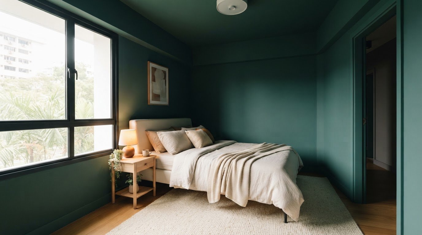
Dark paint can make a small room feel bigger by softening its boundaries and allowing the walls to visually recede. When using dark paint colors in small rooms, carry the shade across the trim or ceiling to reduce sharp visual lines, then balance it with lighter furnishings or layered lighting. The effect depends on how the colour works with the room’s light and finishes, not simply on how dark it is.
It’s understandable to worry that deep shades will make a compact room feel closed in. With a considered palette, they can instead create depth, warmth and cohesion. This guide explains how to balance dark walls with lighter décor, choose shades that work with existing furnishings and finishes, and soften the room’s boundaries, with ideas for bedrooms, home offices and other small spaces.
Key Takeaways
- Carry one shade across walls, trim or ceiling to soften visual edges, then use lighter furnishings to add contrast.
- Choose a dark colour that complements your timber, stone and other hard finishes for a cohesive scheme.
- Use deep shades to blur room boundaries and create a more enveloping sense of depth.
- Compare undertones and finishes in your room’s changing light before settling on a shade.
1. How can you balance dark walls with lighter décor?
Colour drenching means painting the walls, woodwork and ceiling in one shade. This reduces visual breaks, helping a compact space feel more cohesive and sometimes larger. Try deep green on the walls and trim, then add pale cushions or a cream rug. The continuous colour feels dramatic, while lighter accents keep the room from seeming visually heavy.
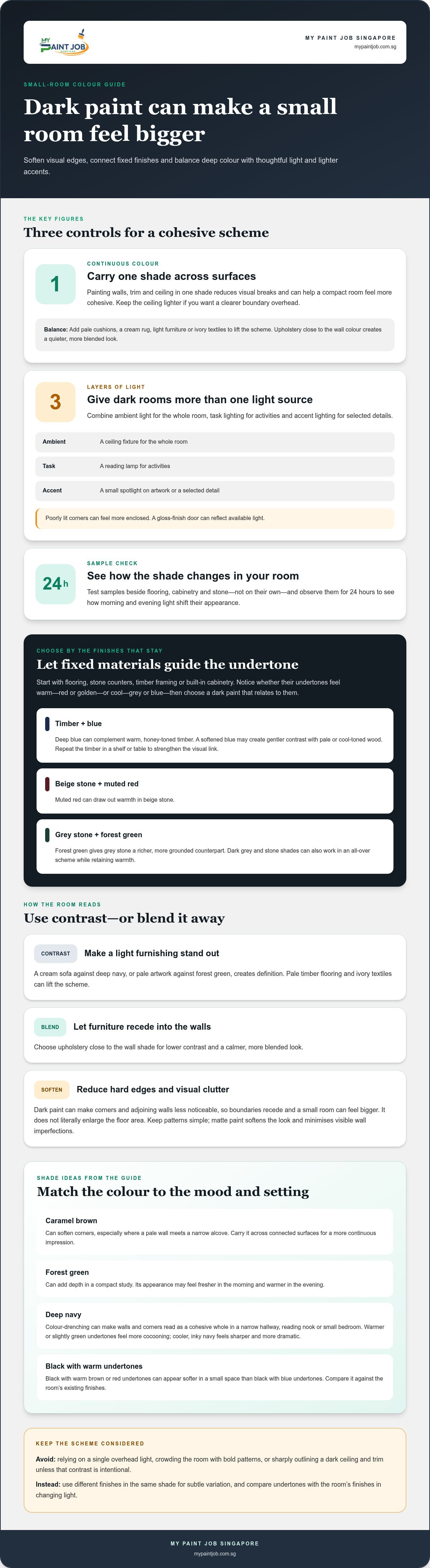
Lighting helps dark paint work by adding distinct layers: ambient light for the whole room, task lighting for activities, and accent lighting for selected details. For example, combine a ceiling fixture with a reading lamp and a small spotlight on artwork. Deliberate lighting matters in dark-painted rooms because poorly lit corners can feel more enclosed. A gloss-finish door can also reflect available light.
Pair dark walls with light furniture, such as a cream sofa against deep navy, to create clear contrast. Pale timber flooring, ivory textiles and simple décor with minimal pattern can also lift the scheme without adding visual clutter. To make furniture recede instead, choose upholstery close to the wall colour. The lower contrast creates a calmer, more blended look.
Painting the ceiling to match the walls can blur the room’s edges, especially when natural or artificial lighting is good. Painting the trim the same colour also reduces visual lines and can make the room feel taller. Use one shade across the walls, ceiling and woodwork for a seamless effect, or keep the ceiling lighter if you want a clearer boundary overhead.
Avoid sharply outlining a dark ceiling and trim against dark walls unless that contrast is intentional. Don’t rely on a single overhead light or crowd the room with bold patterns; both can make the scheme feel busier or less inviting. Matte paint can soften the look and minimise visible wall imperfections, while different finishes in the same shade add subtle variation without introducing another colour.
2. Choosing dark paint shades to suit furnishings and hard finishes
Start with finishes that are unlikely to change easily, such as flooring, stone counters, timber framing or built-in cabinetry. Identify whether each looks warm, with red or golden undertones, or cool, with grey or blue undertones. Then choose a dark paint shade that relates to those undertones. This connects the walls with fixed surfaces instead of making them compete.
Blue paint can complement timber framing, especially when the wood has a warm finish. Try deep blue beside honey-toned timber, then repeat the timber in a shelf or table to strengthen the visual link. If the wood is pale or cool-toned, a softened blue may create gentler contrast. The right pairing makes both materials feel considered rather than disconnected.
For stone finishes, explore deep reds or greens. Muted red can draw out warmth in beige stone, while forest green can give grey stone a richer, more grounded counterpart. Dark grey and stone shades can also work in an all-over scheme, creating a dramatic look while retaining warmth. Compare paint with the actual stone, since nearby colours affect how each appears.
Next, consider the furnishings. A dark wall behind a light sofa creates contrast and makes the furniture stand out; upholstery close to the wall shade blends more quietly. For example, pair charcoal walls with pale timber furniture, or set deep green beside a natural stone surface. Keep competing patterns to a minimum so the room’s finishes remain visually clear.
Test paint samples beside flooring, cabinetry and stone, rather than viewing them alone. Observe them for 24 hours to see how morning and evening light shift their appearance. If spalling concrete has affected a surface you plan to paint, arrange spalling concrete repair before choosing the final finish. Sound, prepared surfaces help the selected colour read consistently.
3. How dark colours can soften room boundaries and add depth
Dark paint can reduce the sharp contrast between adjoining walls, making corners less noticeable. This can change how a small room feels: instead of drawing attention to its limits, the colour helps the boundaries recede. Caramel brown can soften corners, especially where a pale wall meets a narrow alcove. Use it across connected surfaces for a more continuous impression.
Forest green can add depth by absorbing light and lowering contrast at a room’s edges. In a compact study, applying it to the walls can create a focused, inviting atmosphere rather than highlighting the room’s proportions. The shade shifts with changing light, appearing fresher in the morning and warmer in the evening. Consider that variation when deciding which mood suits the room.
Deep navy offers another way to make boundaries feel less defined. Colour-drenching a small space in navy can make its walls and corners read as a more cohesive whole. This can suit a narrow hallway, reading nook or small bedroom, where a strong, unified colour creates a sense of destination. Keep the layout simple so the depth comes from the colour, not competing details.
Undertones also shape how a room feels. In a small space, black with warm brown or red undertones appears softer than black with blue undertones. If you want a dark, intimate effect without stark edges, compare warm black against the room’s existing finishes. Dark paint doesn’t literally enlarge the floor area, but it can make boundaries less prominent and the space feel bigger. Pair a deep shade with lighter accents where you want definition, such as a pale artwork frame against forest green. A matte finish gives a soft, chalky quality that helps dark colour feel rich rather than overpowering.
4. Dark paint color choices
Choose a dark shade for its undertone, not just its name. Rich undertones can make a compact room feel luxurious and inviting, while undertones that clash with existing finishes can create visual tension. For a classic, cocooning effect, try navy with warmer or slightly green undertones. Cooler, inky navy creates a sharper, more dramatic feeling.
In a small room, muted burgundy with soft undertones can make the walls less noticeable. Dark red can also suit a home office, creating a calm setting for focus. In a bathroom with little natural light, warm undertones can help the space feel less confined. Match the shade’s mood to the room’s purpose.
Caramel brown offers a warm foundation for brighter accents. Add cobalt blue, grassy green or earthy red through artwork, textiles or a small accessory. Forest green is another option for a home office, creating a purposeful backdrop with less visual noise. Its appearance changes with the light, looking fresher in the morning and warmer in the evening.
Soft black can bring drama or cosiness to a small bedroom or powder room. Choose black with brown or red undertones for a softer impression than blue-undertoned black. For a more unified look, consider colour-drenching in deep navy to blur boundaries and create dimension. Navy also suits intimate dining rooms, vestibules and reading nooks.
Use this simple selection process: identify the room’s fixed finishes, decide whether you want a warm or cool mood, then compare sample shades in the room’s light. Observe them for 24 hours, including morning and evening. A matte finish gives dark paint a soft, chalky appearance. For help planning a room refresh, discuss your paint finish with a painting professional.
My Paint Job Singapore: HDB painting services
My Paint Job Singapore provides HDB painting services for homeowners planning a dark colour scheme, from a single room refresh to a coordinated interior repaint. Its painting services also cover condos, landed homes and commercial properties. Turn to the team when you’ve chosen a palette and want careful surface preparation and a considered paint finish to bring it together. My Paint Job Singapore uses premium, eco-friendly paints and meticulous preparation to support a high-quality result. Share your preferred shades, furnishings and finish ideas to shape the project around your space. For help planning your repaint, contact My Paint Job Singapore.
Plan a paint scheme that feels like yours
Using dark paint colors in small rooms is as much about the mood you want as the visual effect. Before committing, decide how you want the space to feel at different times of day, then consider how the shade will work with your belongings and daily routines. A compact bedroom might call for a restful, cocooning atmosphere, while a study may benefit from a focused, purposeful backdrop.
If you’re ready to turn your ideas into a finished room, My Paint Job Singapore offers HDB, condo and landed painting services. Share the look you’re aiming for and the surfaces you’d like refreshed. A considered plan can help make your colour choice feel intentional throughout the space, from the first coat to the final details.
Contact My Paint Job Singapore to discuss your painting project, and take the next step toward a room that reflects your style.
Frequently Asked Questions
Can dark paint colors actually make a small room feel bigger?
Yes, using dark paint colors in small rooms can make their edges seem less distinct, creating an impression of depth rather than adding actual floor space. In a compact Singapore study, for example, a continuous dark shade can help the walls feel less visually separate. Keep the arrangement purposeful, and use a lighter focal detail, such as framed art, to give the eye a resting point.
How can you balance dark walls with lighter décor?
Choose a few lighter pieces rather than scattering pale accents everywhere. In a bedroom with deep green walls, light bedding and a pale bedside lamp can create contrast while keeping the palette composed. Repeat a light tone in a small detail, such as a cushion or frame, to make the arrangement feel intentional. Let one or two darker accessories connect the décor back to the walls.
Should you use matte or glossy finishes with dark colors?
Matte is a strong choice for dark walls when you want a soft, restrained look; it also helps reduce the visibility of minor surface imperfections. Gloss reflects more light and creates a striking highlight, but draws attention to the surface beneath it. Consider using sheen selectively, such as on a door, rather than applying a reflective finish across every wall.
Do dark paint colors make small rooms look smaller or larger?
Dark paint can create either impression, depending on how the room is painted and furnished. A sharply contrasting border may emphasise the room’s limits, while a more continuous scheme can make its edges less obvious. Dark shades also tend to create a closer, more intimate feeling than pale colours. Decide whether you want the room to feel enveloping or open before choosing the overall scheme.
Which dark paint colors work best in small rooms?
Navy, forest green, muted burgundy, caramel brown and soft black can all suit compact spaces. Choose according to the atmosphere you want: navy can feel classic, forest green can make a study feel purposeful, and warm black can soften the mood. For a bedroom, consider a muted shade; for a powder room, a more dramatic colour can make the small space feel distinctive.
Which finish is best for dark paint in a small room: matte, eggshell, or satin?
Matte is often a suitable starting point for dark walls because it gives colour a soft appearance and minimises the look of minor wall flaws. Eggshell offers a gentle sheen, while satin reflects more light for a brighter effect. Compare finish samples on the intended surface, since the room’s lighting and wall condition affect how each sheen appears.