
A fresh office paint scheme is not simply a cosmetic update. The right office color trends can make a reception area feel more credible, help work zones feel calmer, and give staff a space they are happy to return to each day. The wrong choice can look dated quickly, reflect harsh lighting, or show marks after only a few busy weeks.
For offices, the best color decisions balance appearance with practical demands. Walls need to support concentration, suit your brand, work with existing furniture, and remain easy to maintain. That is why the strongest trends are moving away from one-color, all-white spaces and toward warmer, more intentional palettes.
Office Color Trends Are Moving Toward Warmth
Cool gray once dominated commercial interiors because it felt clean and modern. It can still work in the right setting, especially alongside warm timber, textured flooring, or abundant daylight. Used wall to wall, however, a cold gray scheme can make an office feel flat and uninviting.
Warm neutrals are now a more flexible foundation. Think soft greige, putty, mushroom, sand, muted taupe, and creamy off-white. These colors make a workspace feel polished without becoming clinical. They also work well with black-framed glass partitions, wood finishes, indoor plants, and the mixed furniture common in growing businesses.
A warm neutral is particularly useful when an office has several functions in one footprint. It provides a consistent base across meeting rooms, open workstations, pantries, corridors, and reception areas, while allowing each zone to have its own accent color. The result feels coordinated rather than overly decorated.
Before selecting a shade, always test it under the office’s actual lighting. A beige that looks balanced in a paint card can turn yellow under warm downlights or appear dull under cool LED panels. Large sample patches viewed at different times of day give a much more reliable answer than a small swatch.
Nature-Inspired Colors for Focus and Comfort
Soft greens are among the most practical office color trends because they bring character without demanding attention. Sage, eucalyptus, olive-gray, and dusty green can make collaboration areas and meeting rooms feel more relaxed. They pair naturally with timber furniture, stone-look surfaces, and neutral upholstery.
Blue remains a dependable choice for businesses that want a composed, professional atmosphere. Muted blue-gray, smoky denim, and deep slate blue work especially well in boardrooms, client-facing spaces, and focused work zones. They can communicate calm and confidence, but a very dark blue may make a small room feel tighter if there is limited natural light.
Earthier tones are also appearing in offices that want a warmer, more human look. Clay, terracotta, cinnamon, and softened rust are effective as controlled accents behind a reception desk, on a feature wall, or in a café-style breakout area. These shades bring energy, though they need restraint. Painting every wall in a saturated color can quickly overwhelm the room and make future rebranding more difficult.
Use Color to Define How Each Space Is Used
A well-planned office does not need every room painted the same color. Color can quietly signal what a space is for, helping employees and visitors move through the workplace more naturally.
Reception spaces benefit from a clean, welcoming base with a more confident brand-led wall. A deeper neutral, muted green, or signature brand color behind the logo can create a strong first impression without covering the entire area in a bold shade. The finish should look precise around signage, glass, and built-in cabinetry, where untidy edges are immediately noticeable.
For open work areas, lighter warm neutrals usually give the best long-term flexibility. They reflect light, make the floor plate feel larger, and allow desks, acoustic panels, and branding elements to change without requiring a full repaint. If the space needs more definition, use a muted accent wall at the end of a workstation bank rather than surrounding staff with dark colors.
Meeting rooms can accommodate more depth. A calm blue, forest-inspired green, or charcoal-tinted neutral can reduce visual distraction and improve the sense of privacy. In rooms used for video calls, avoid excessively bright white walls or glossy finishes, which may cause glare on camera.
Breakout areas and pantries are where warmer accent shades make the most sense. A terracotta, soft peach, or optimistic yellow-beige can bring warmth to a space intended for informal conversations and short breaks. The color should still connect to the rest of the office so it feels like part of one workplace, not a separate design idea.
Brand Colors Need a Practical Plan
Many businesses want to feature their brand colors, but using a bright corporate shade everywhere is rarely the strongest solution. A vivid red, orange, or electric blue may look excellent in a logo while becoming tiring across large walls.
The more durable approach is to use your brand color strategically. Place it on a focal wall, around selected architectural details, in directional areas, or within a reception backdrop. Then support it with neutral colors that let the brand stand out. This gives the office a clearer identity while keeping the working environment comfortable.
If your company is planning a rebrand, choose a base palette that can survive the change. Warm whites and versatile neutrals can stay in place while smaller accent areas are repainted later. This reduces disruption and helps manage future maintenance costs.
Paint Finish Matters as Much as the Shade
Office walls face fingerprints, chair scuffs, moving equipment, and frequent cleaning. A color may look right, but the wrong paint finish can leave the space looking worn before its time.
For most walls, a quality low-sheen or eggshell finish gives a clean appearance with better washability than a flat finish. It has enough durability for hallways, work areas, and meeting rooms without creating the obvious shine that can highlight wall imperfections. Matte finishes can look refined in executive spaces or low-traffic rooms, but they may require more careful maintenance.
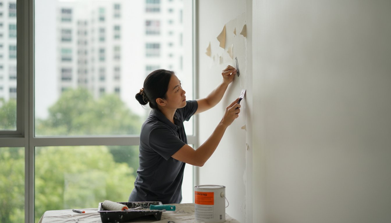
Semi-gloss is often better reserved for doors, trim, and high-contact surfaces. Its harder-wearing surface is useful, although too much shine on broad walls can make patching, uneven plaster, and light reflections more visible. Where surfaces have cracks, dents, peeling paint, or moisture damage, preparation must come before the topcoat. A new color cannot hide an unsound wall for long.
Plan the Repaint Around Operations
The most appealing color palette still has to be installed with minimal interruption to your business. Offices with tight deadlines may need phased painting after hours, over weekends, or room by room so essential teams can remain operational. An express painting schedule can be appropriate for urgent handovers, but it should not mean skipping surface protection or proper preparation.
A professional painting team should inspect the walls first, confirm the condition of existing coatings, protect furniture and flooring, and plan access around workstations, IT equipment, and meeting schedules. Clear communication matters just as much as clean brushwork. Employees should know which areas are affected, when rooms can be used again, and how ventilation will be managed.
Low-odor, eco-friendly paint options are worth considering for occupied workplaces, particularly where staff return soon after painting. The best choice depends on the surface, required durability, drying time, and indoor air quality needs. Paying for a suitable paint system is usually more cost-effective than choosing a cheap product that needs early touch-ups.
Get a Palette That Still Looks Good Next Year
Trends should provide direction, not force an office into a style that does not fit the business. A creative studio may have room for bolder color blocking, while a legal office, clinic, or financial services firm may need a quieter palette that reinforces trust. Natural light, ceiling height, furniture, cleaning routines, and brand identity all influence the right answer.
At My Paint Job, color consultation can be paired with careful surface preparation, furniture protection, professional application, and cleanup for a finished office that is ready for business. A thoughtful palette does more than follow a trend – it helps your workplace look organized, welcoming, and ready to make the right impression every day.