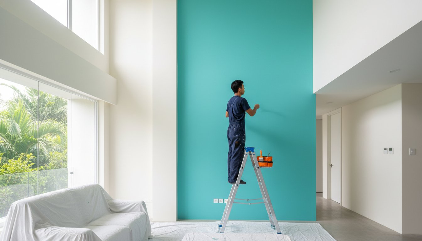
A tired office often shows up in the walls first. If a space feels dim, distracting, or dated, even good furniture and lighting can only do so much. Choosing the best paint colors for offices is not just about appearance – it affects how professional the space feels, how comfortable people are during long workdays, and how clients respond the moment they walk in.
For most offices, the right color choice needs to do three things at once. It should support focus, work well under artificial and natural light, and still look clean and current over time. That is why the best result usually comes from balancing design with practicality rather than chasing trends that age quickly.
What makes the best paint colors for offices work
Office paint has a different job from paint in a bedroom or living room. In a workspace, color needs to hold up against bright task lighting, computer screens, frequent cleaning, and daily foot traffic. It also has to suit the type of work being done. A law office, a creative studio, and a shared admin workspace may all need very different moods.
That said, the strongest office colors usually have one thing in common: restraint. Overly bold shades can look exciting at first but become tiring when employees spend eight or more hours around them. Very dark walls can appear elegant in the right setting, but they can also make smaller offices feel closed in. On the other hand, flat white can feel sterile if there is no warmth or contrast in the room.
The best office palettes tend to sit in the middle. They create a calm background, give the space a polished finish, and let branding, furnishings, and signage stand out where needed.
Soft white for a clean, professional base
Soft white is one of the safest and most effective office choices because it keeps a space bright without feeling harsh. This is especially useful in smaller offices, reception areas, and rooms that do not get strong daylight. A warmer white can make the environment feel more inviting, while a cooler white tends to feel sharper and more modern.
The trade-off is that not every white works well in every office. A very stark white can exaggerate glare from overhead lighting and make walls feel cold. In most commercial spaces, a soft white with a slight warm or neutral undertone gives a more balanced result.
Light gray for focus without dullness
Light gray remains one of the best paint colors for offices because it feels professional and understated. It creates a calm backdrop for meetings, desk work, and shared workspaces without pulling too much attention. It also pairs easily with black, wood, glass, and metal finishes, which makes it a flexible option for modern offices.
The key with gray is undertone. Some grays lean blue and can feel chilly. Others lean beige and feel softer. In spaces with cool LED lighting, a very blue gray may make the room feel flat. A balanced light gray usually performs better and keeps the office looking current without becoming too corporate or severe.
Greige for warmth and versatility
If white feels too plain and gray feels too cool, greige often lands in the right place. This mix of gray and beige has become popular because it adds warmth while still looking polished. It works especially well in private offices, waiting areas, and conference rooms where comfort matters as much as professionalism.
Greige also suits businesses that want a more welcoming appearance without moving into obvious color. It can soften the overall look of an office and help older commercial interiors feel updated. For landlords and office managers preparing a unit for new tenants, it is often a reliable choice because it appeals to a wide range of tastes.
Muted blue for calm and concentration
Blue is often associated with trust, stability, and focus, which makes it a natural fit for office settings. A muted blue-gray or dusty blue can bring personality into a workspace without overwhelming it. This shade works well in meeting rooms, executive offices, and areas where a calm, composed atmosphere matters.
Still, blue needs careful handling. Bright or saturated blues can feel too intense for full-room coverage, especially in smaller spaces. In most offices, a muted version works better as either the main wall color or a feature wall paired with neutral surroundings.
Sage green for balance and visual comfort
Sage green has become a strong office color because it feels grounded and easy on the eyes. It offers a subtle connection to nature, which can make indoor work environments feel less rigid. In offices where people spend long hours at desks, that softer visual effect can make a real difference.
Sage also works well with wood furniture, plants, and natural textures. It is especially effective in consultation rooms, wellness-focused businesses, and offices that want a calm but updated look. The main consideration is lighting. In dim rooms, some greens can appear muddy, so testing the shade under actual office lighting is worth the effort.
Beige and taupe for approachable professionalism
Beige and taupe are sometimes dismissed as too safe, but in offices they can be very effective. These shades create warmth, reduce the clinical feel of stark neutrals, and suit businesses that want clients and staff to feel at ease. They are often a good match for traditional offices, service businesses, and mixed-use spaces where comfort is part of the customer experience.
What matters is choosing a modern version. Older beiges can look yellow or dated, while a well-balanced taupe feels cleaner and more refined. When paired with good trim work and a smooth finish, these colors can make an office look polished rather than plain.
Charcoal as an accent, not the whole story
Charcoal can give an office a premium, high-contrast look when used with control. It is a strong option for feature walls, boardrooms, branded spaces, or areas where you want a more dramatic impression. Used alongside lighter neutrals, it can make a space feel intentional and upscale.
But charcoal is rarely the best choice for every wall. In smaller offices or rooms with limited daylight, it can make the space feel heavy. It also shows dust and surface imperfections more easily. For most businesses, charcoal works best as part of a balanced palette rather than the entire scheme.
How office function should guide color choice
The best paint colors for offices depend partly on who uses the space and what happens there each day. Open-plan offices usually benefit from lighter, quieter tones that reduce visual noise. Private offices can handle a little more depth and personality because fewer people are exposed to the color all day.
Reception areas should look polished and welcoming, which is why warm whites, greiges, and soft grays are common choices. Conference rooms often benefit from colors that support focus and calm discussion, such as muted blue, greige, or light gray. Creative teams may prefer a more expressive palette, but even then, it usually works better to keep the main walls restrained and introduce stronger colors through one feature wall or branded elements.
Paint finish matters as much as color
Even the right shade can disappoint if the finish is wrong. In offices, durability and appearance need to work together. Flat paint can hide wall imperfections, but it is harder to clean. High-gloss paint is durable, yet it can emphasize every patch and surface flaw.
For most office interiors, an eggshell or low-sheen finish offers the best balance. It looks neat, reflects a manageable amount of light, and is easier to maintain in busy spaces. This is one reason professional preparation matters. A smooth, well-prepared wall gives a more polished final result and helps the chosen color look consistent across the whole office.
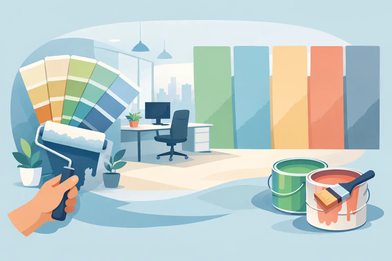
Why testing colors saves time and money
Paint swatches can look very different once they are on the wall. Office lighting, window direction, ceiling height, flooring, and furniture all affect how a color reads. A gray that looks balanced in a sample book may turn blue under LEDs. A warm white may look too creamy next to cool flooring.
Testing first helps avoid expensive rework and prevents disruption later. For businesses working on a schedule, getting the color right before full application is part of a smoother project overall. A dependable painting team will usually guide that process, from assessing the space to recommending shades that fit both the brand image and the practical needs of the office.
A well-painted office should do more than fill the walls with color. It should make the space easier to work in, easier to present, and easier to maintain. If your office is starting to feel tired or mismatched, the right paint choice can change that faster than most renovations – and with the right preparation and workmanship, the result will look professional from the first impression to the final cleanup.